
All Identity Packaging Spirits Hospitality Skincare & Makeup Lifestyle Food & Beverages Corporate Ready-Made Brands
Project: TAT
Year: 2023
Type / Category: Identity, collaterals.
Location: Mexico
Introduction: In each intervention, TAT seeks to find the story that a place has to tell and the essence that differentiates it from the rest.
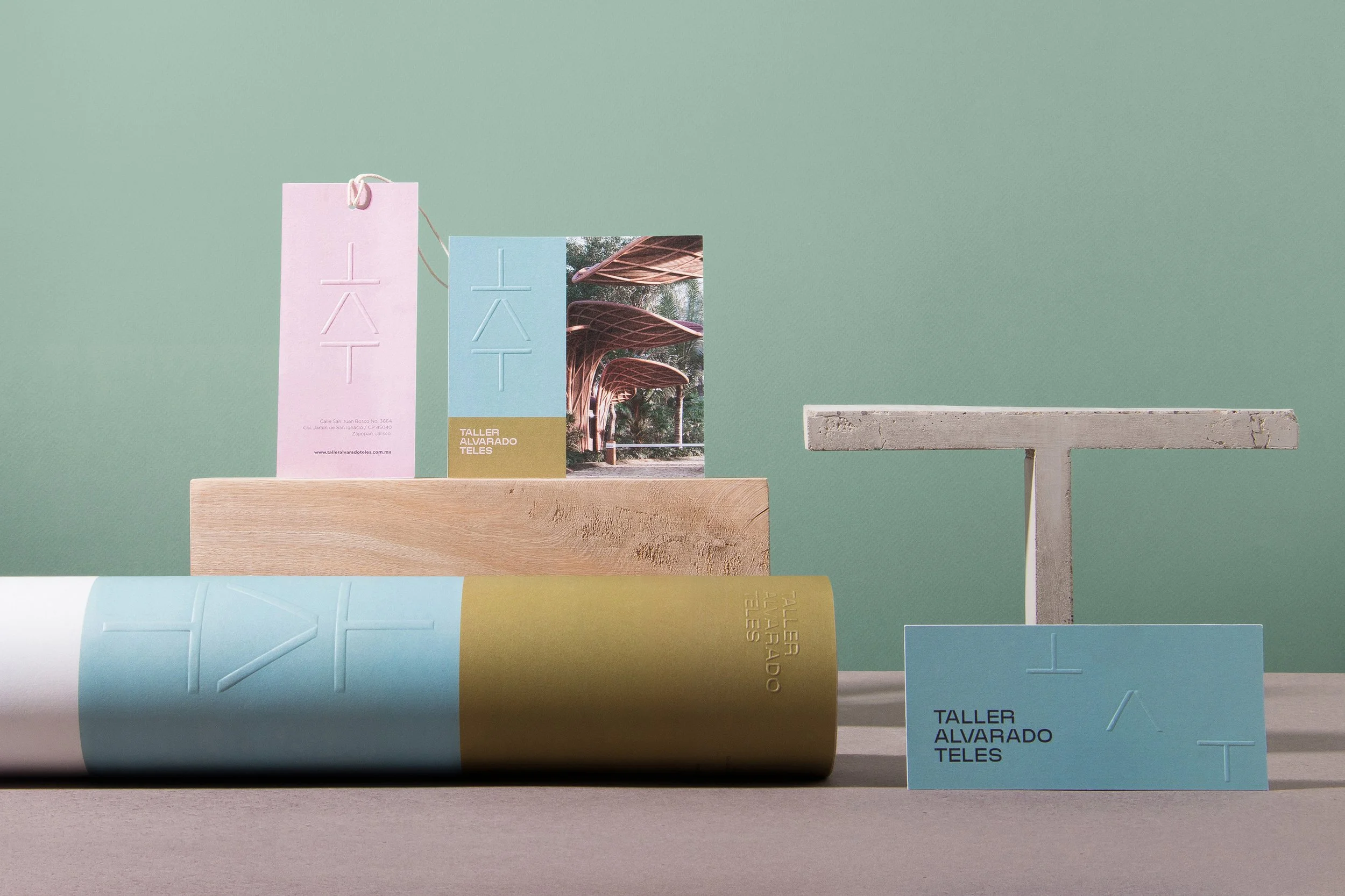
The identity is versatile and focuses on the craftsmanship behind their work. The modules and angles placed together emulate spaces and structures; they represent the crossing point between us and the environment. The typography of the logo is structured with organic details that remind us that in the end these spaces will be inhabited by human beings. The isotype is a flexible element that can be transformed to achieve different compositions or structures. The color palette is different from what the category proposes, which gives it a unique personality very similar to that of the team behind TAT. For the collateral pieces we let the artwork and colors be the protagonists, leaving the printed isotype in highlight to be a decorative element ready to be discovered.
Manifiesto: We are a workshop where creating is expressing ideas, emotions, perceptions and sensations. We respect the sense of the processes and their time. In each intervention we seek to find the story that each place has to tell and the essence that differentiates it from the rest. We focus on contributing to elevate the experience and meaning of the spaces, awakening the senses of those who conform it, from an integral and sustainable vision.
Artisans of identities, we sculpt for each story, spaces that become an extension of our lives. We strengthen the sensorial connection with spaces, through the experience and creation of new meanings.


