Project: SOTERI SKIN
Year: 2022
Type / Category: Branding, brand strategy, label, packaging, copywriting, art direction.
Location: United States
Introduction: SOTERI SKIN is a brand of products that seeks a balance between protection, science and beauty for skin care.
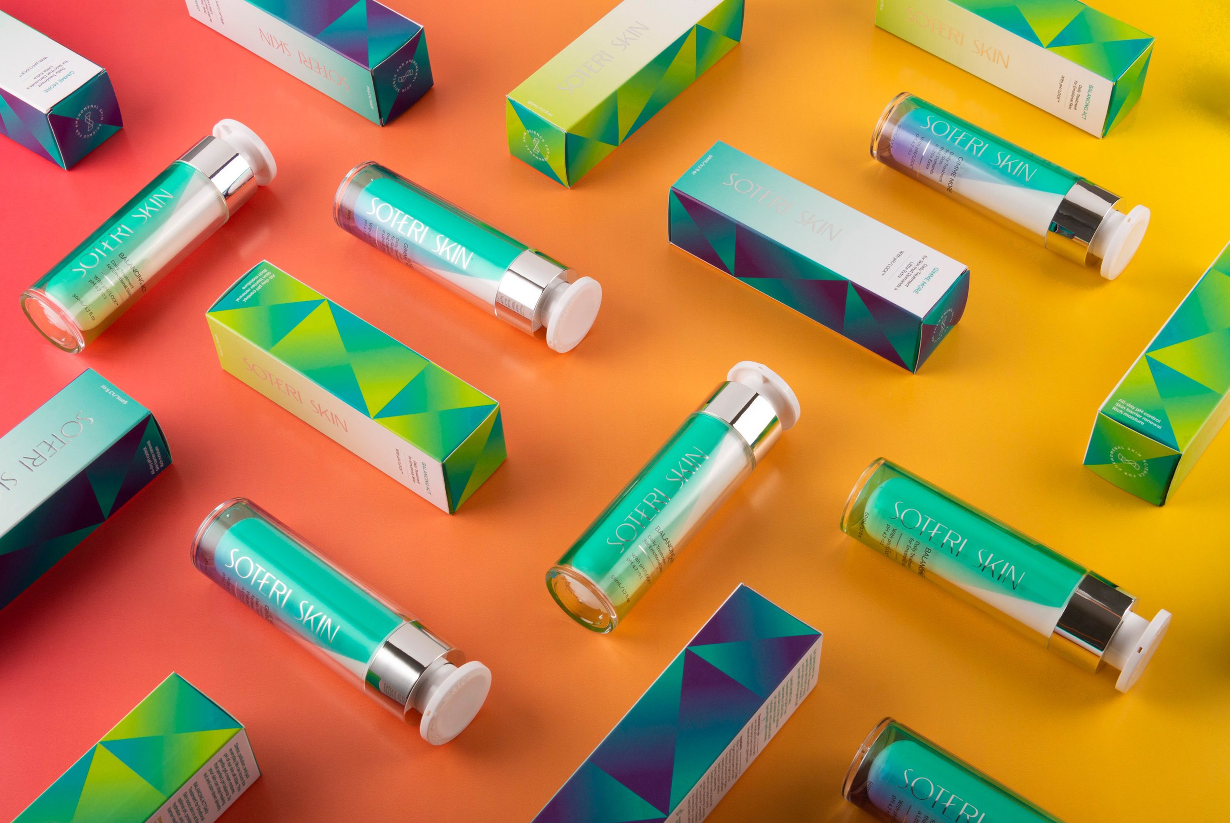
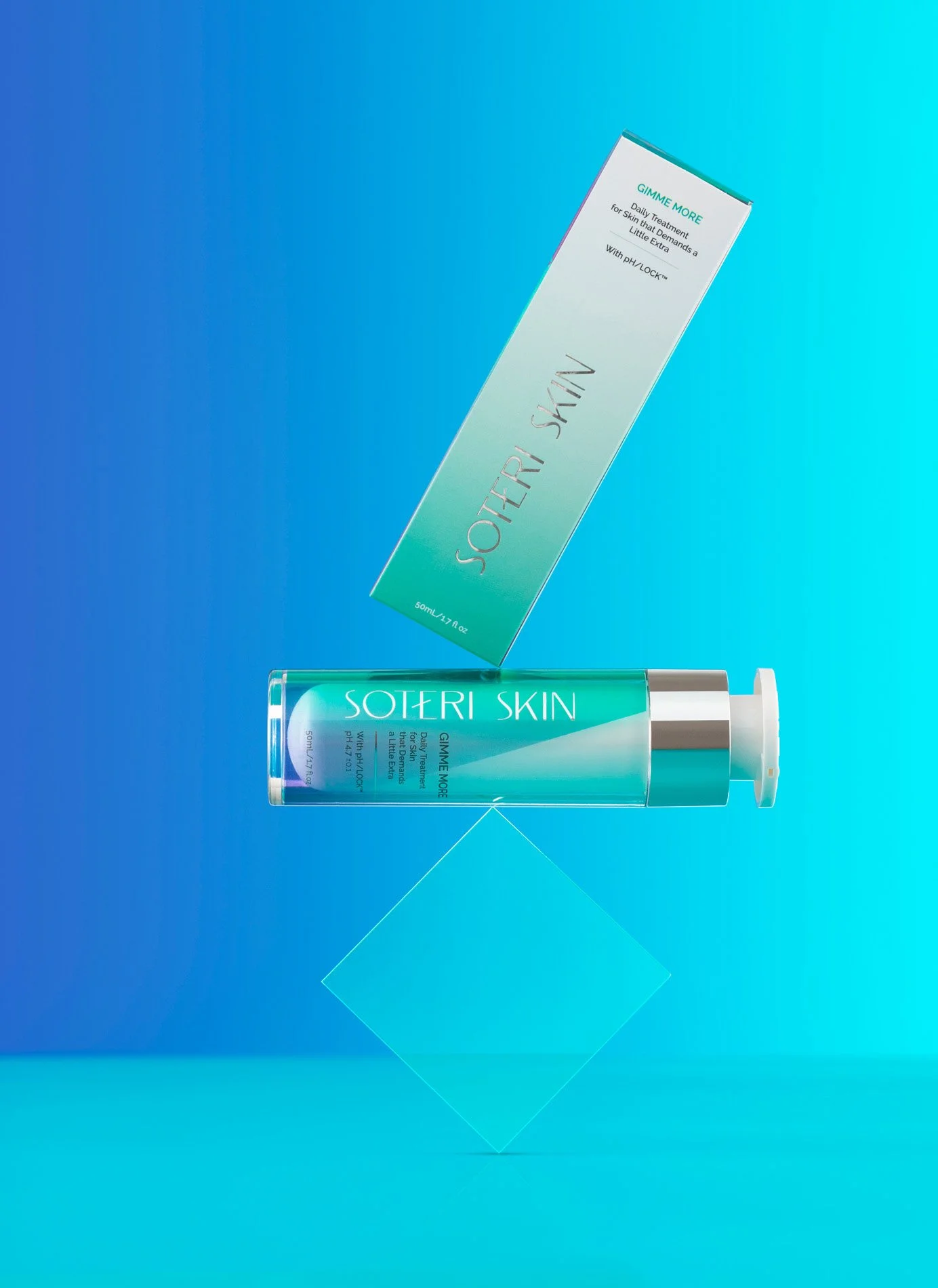
For SOTERI SKIN we created geometric shapes that form a pattern to emphasize the concept of balance and protection, as well as a unique, stylized and contemporary semi-serif typography. We created a monogram that represents the balance of the concept in a contemporary and minimalist way to give it a clinical touch. For the packaging we used a series of geometric patterns that helped create a family of products where the color adapts to the different types of items that the brand has.
Manifiesto: At SOTERI we are convinced that beauty is balance, especially when it comes to skin. Inspired by our ancient protectors, we have used our scientific knowledge to develop a product that protects you and goes at your pace. We know that healthy skin not only looks good, but is also reflected in the security and confidence with which we face the challenges of a fast-paced and stress-filled world.
We are committed to achieving that balance in your skin so that it remains protected and naturally radiant at all times. We want you to feel empowered after finding in SOTERI the healing and safe place that you have been looking for and needing for a long time.