Project: PRIMO 1861
Year: 2021
Type / Category: Brand strategy, identity, label, packaging, copywriting.
Location: Mexico
Introduction: TEQUILA PRIMO 1861 is a tribute to Pedro Camarena, founder of the first tequila distillery in Arandas, Jalisco. We developed a graphic proposal that conceptualizes the idea to conquer new horizons regardless of the difficulties to be the first one, despite the fire, time and memory.
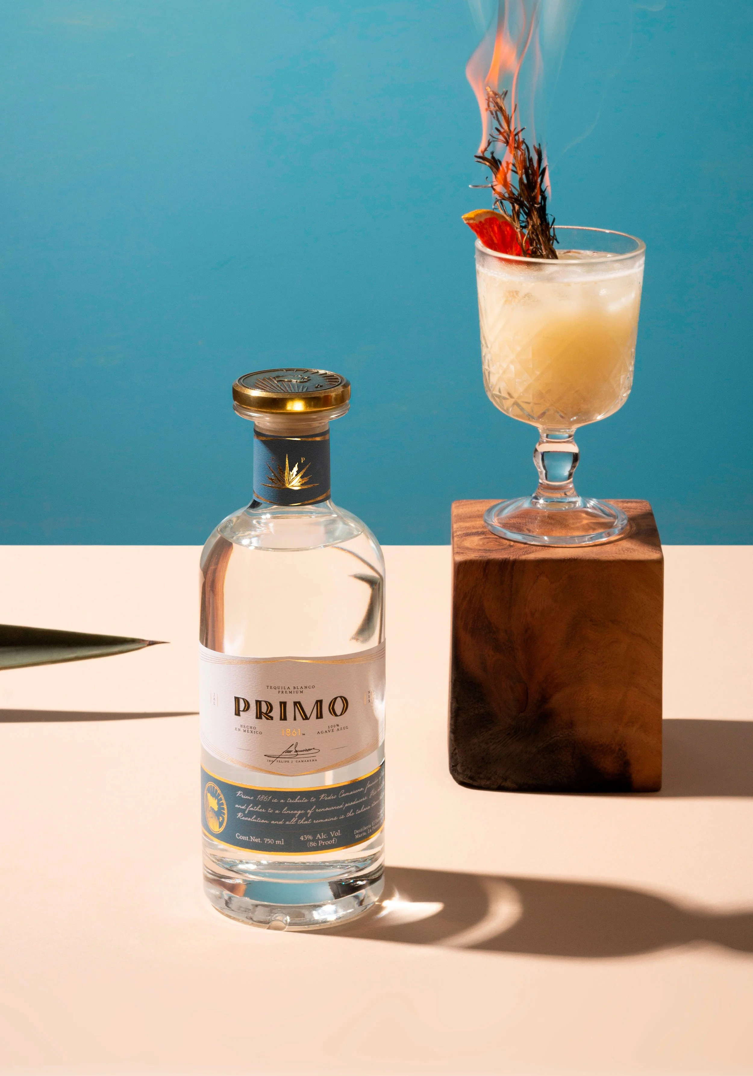
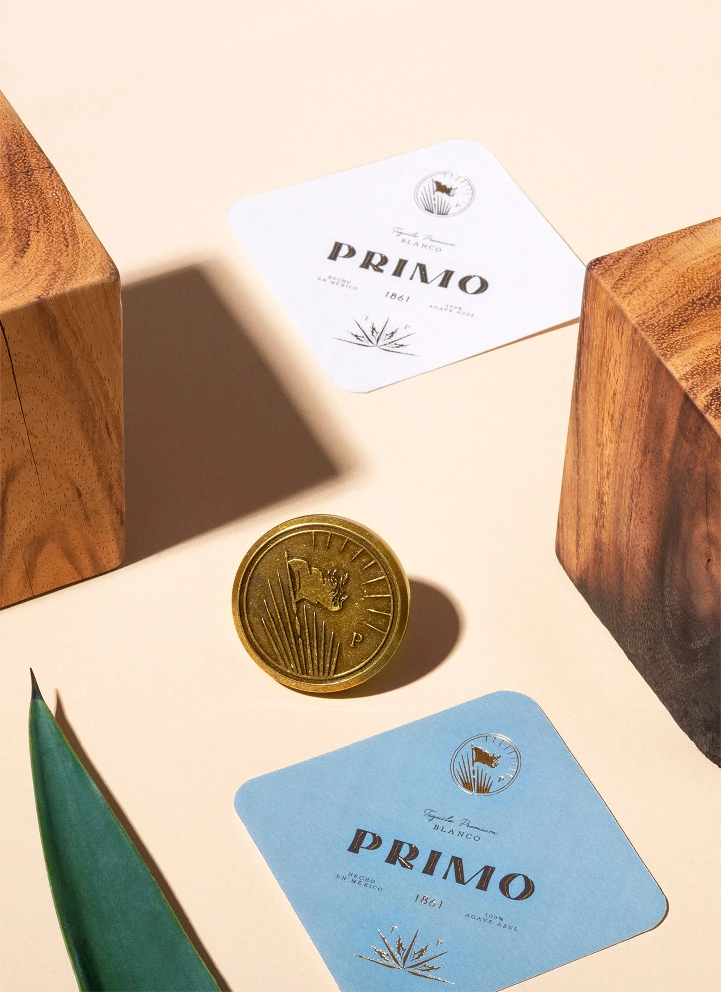
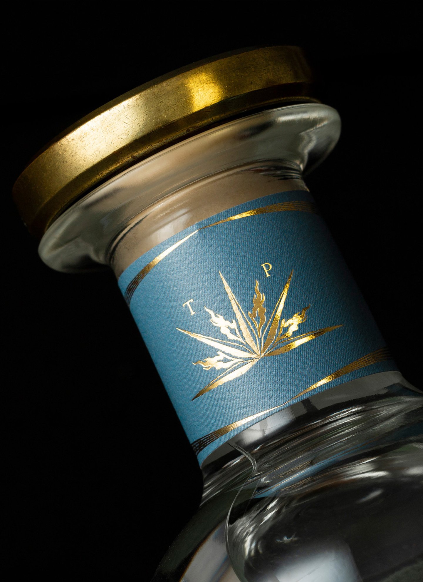
A bold typography was developed for the logo to represent the strength of tequila and the history of the Camarena family. A series of auxiliary graphic elements were created to tell the story and the relationship that the hacienda has with fire, as it is the element that makes tequila what it is. A set of stylized labels with gold foil elements were designed to communicate that this is a premium tequila, and a custom-made cap in gold was designed to give the bottle a unique personality and perfectly complement the brand's concept. A premium wood box was also developed so that the Primo bottle could have a place to the level of its contents.
Manifiesto: It is in our blood to keep moving, always one step ahead of others. To be willing to go for the conquest of new horizons, no matter the difficulties, always ready for the adventure of what has not been lived.
Since 1861 we know what it is to listen to your own voice and follow your destiny, we know what it means to bet on the discovery of something that until then had only been possible in dreams.
We know that the fire within us is the impulse that made us arrive and plant a flag in this territory unknown to most people and proudly affirm that you have been the first.