Project: MUSEO DE LA RADIO
Year: 2019
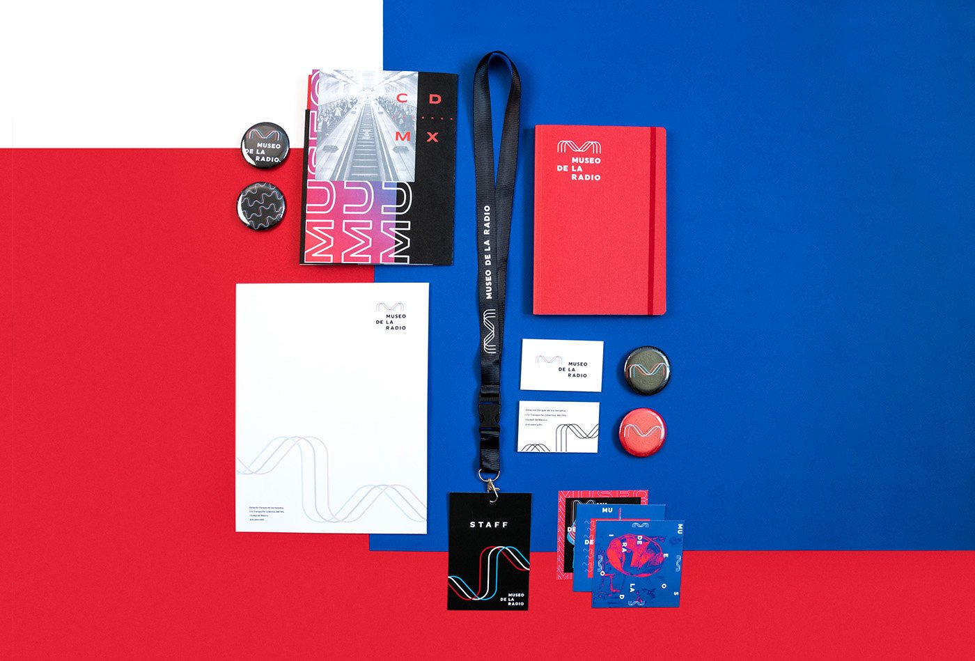
Type / Category: Identity, collaterals.
Location: Mexico
Introduction: MUSEO DE LA RADIO is a forum for the diffusion and promotion of radio in the CDMX that is located in the station Parque de los Venados in the same city.
For the concept of the brand we took the basic concept of radio: the energy that travels in waves until it finds a receiver. These waves can take different forms according to frequency, speed and length; these waves become the letter "M" in the word museum. The three intertwined "M" represent the parts that give it life: the radio, the audience and the place.
For the logotype we developed a bold typography that gives stability to the waves of the isotype. The primary colors is the chromatic selection, together with the black color create a technological and modern environment.
Manifiesto: Radio is a living force that flows with waves that are more than just electromagnetic impulses; they are the common thread that unites generations, technologies and emotions. It comes to life defying the limits of communication with waves that evolve, adapt and flow, creating a force that links in an unparalleled way. We are a forum that celebrates the pulsating energy that connects radio, audience and place in a unique symphony.