Project: Kind Tree
Year: 2024
Type / Category: Identity, packaging, collaterals, copywriting, art direction
Location: California, USA
Introduction: Kind Tree is a cannabis brand that seeks to reflect the attention they pay to their plants by offering the most natural care in their organically grown products.
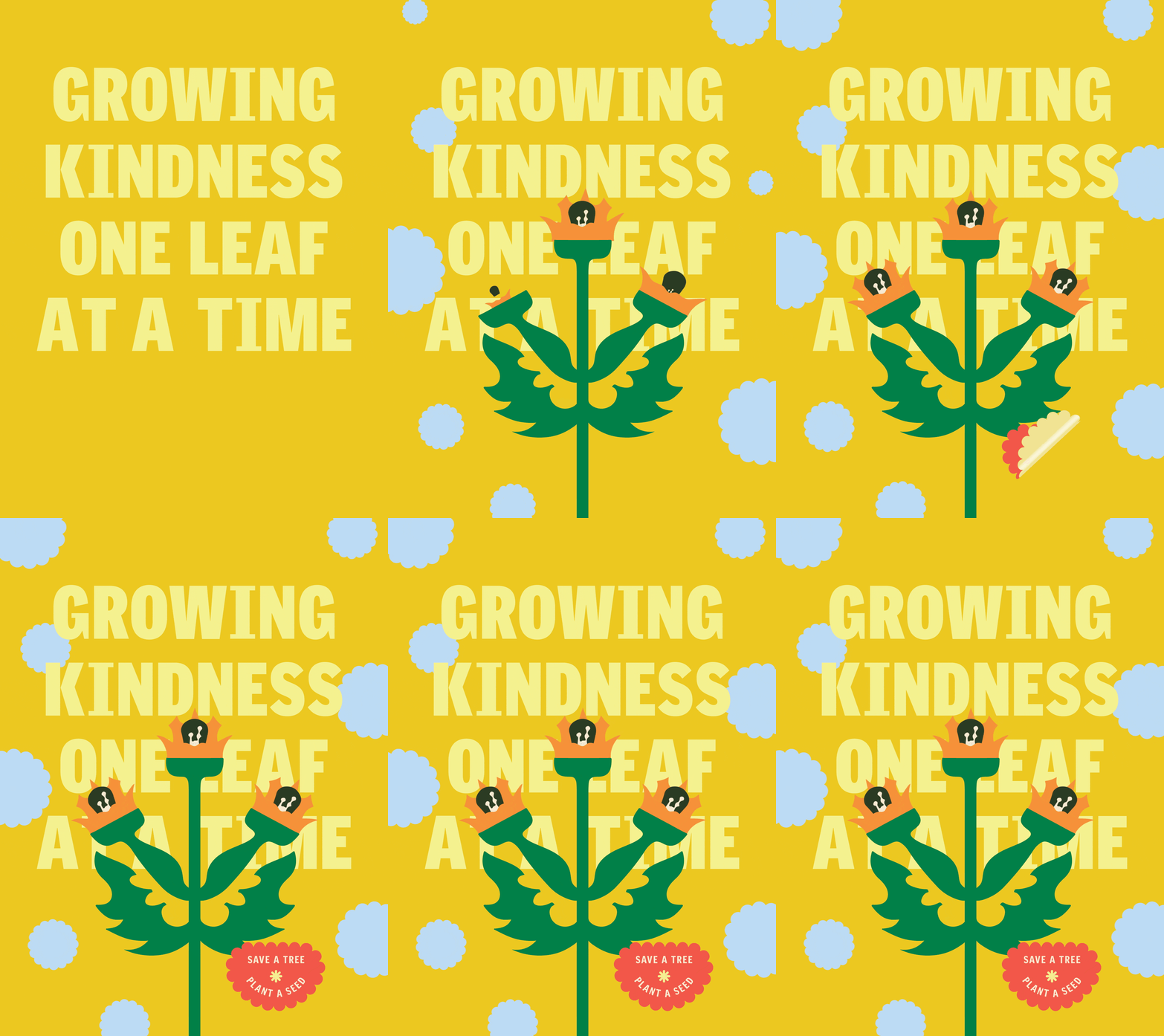
Kind Tree's identity is inspired by different graphics from the 70s, combining its psychedelic style with Pop elements, making the brand look expressive and friendly.
For the logotype, we developed a bold typography with friendly features, plus a graphic element installed in the letter i, representing the blooming of cannabis leaves in a Pop way, giving the brand a touch of fun. We used this graphic element as a base in the branding, to develop several pieces that give life to the brand.
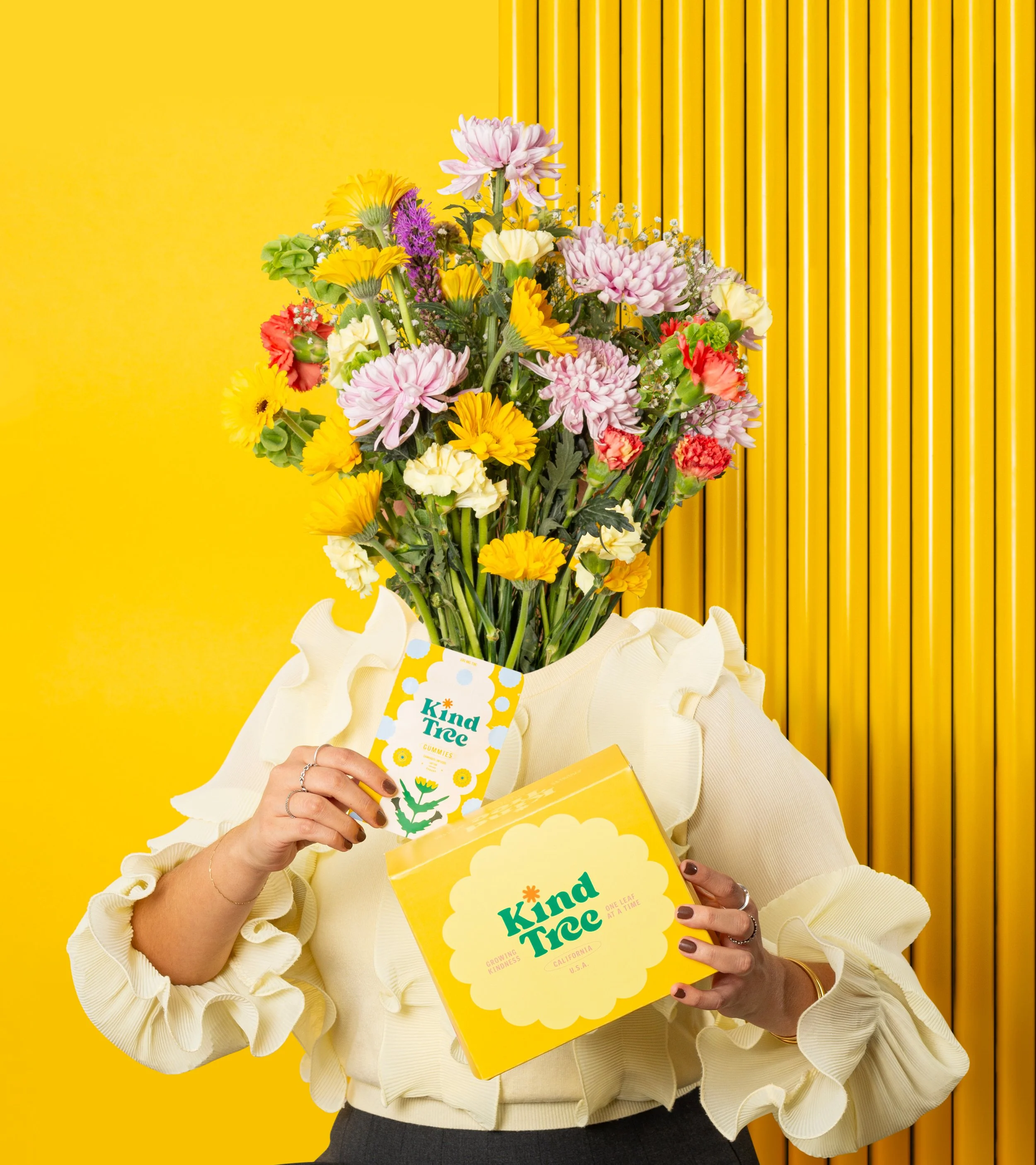
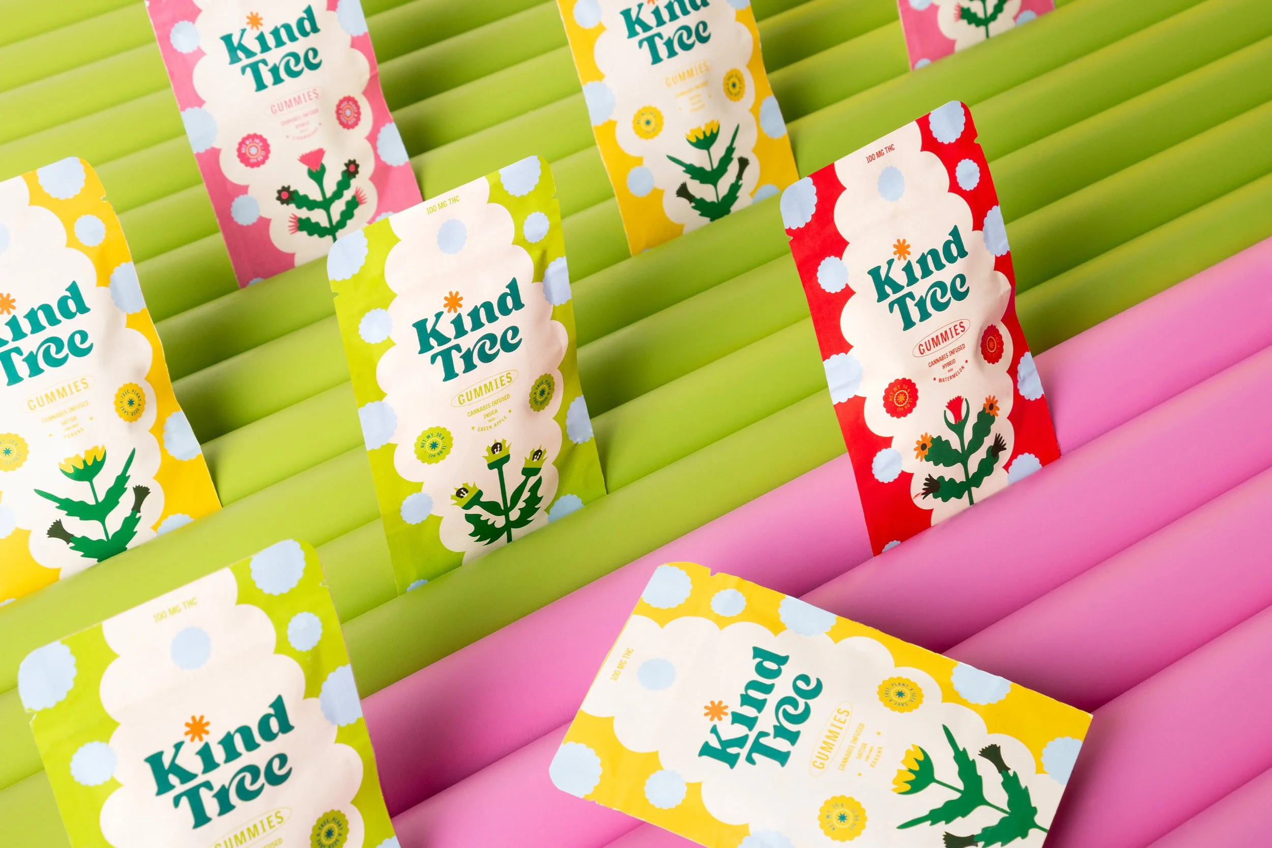
As part of the project, we developed packaging, illustrations, and auxiliary graphics, maintaining a psychedelic-pop style that reflects the vibrant personality of the branding.
Manifiesto: Our cannabis is the result of a patient and respectful process with nature, knowing that what is truly worthwhile takes time. We let Earth do its job by feeding each plant with its nutrients, energy, and wisdom; after all, when you take the time to connect with nature, she rewards you with an authentic experience where every second is fully enjoyed; because the best of life is not rushed.


